Yesterday afternoon the Mon Goals boys caused a little bit of a stir when they came across a Riverhounds kit concept-
Could these be legit? Thoughts? pic.twitter.com/aEX7g9VbxQ
— Mon Goals (@mongoals) October 24, 2017
Unfortunately for us, as sexy as that kit is, it’s just a fan concept and not something we’ll see. However it did get me thinking about kits, and the more I thought about it the more I kept coming back to one thing I really want to see and think would be a good look for the Hounds – dark kits.
When I say dark kits I don’t mean just straight black like they’ve had before. Black is fine and all, but it’s typically not very exciting. When I say dark kits I mean a dark scheme. Blacks, and more importantly, greys. Black and gold will always be Pittsburgh’s colors, but adding grey to that mix opens up a lot of possibility while also evoking our industrial past. A good example of a team that ran with a grey scheme is Minnesota-
They’ve switched to a lighter grey since going to MLS, but boy did those dark grey and black kits look sharp. If the Hounds are still thinking rebrand, and are looking for a distinct style that they can really own, greys are there for the taking. Gold primary kits, and a black/grey secondary. Damn son. Nobody in the USL is going for anything like it either. It would become recognizably Hounds.
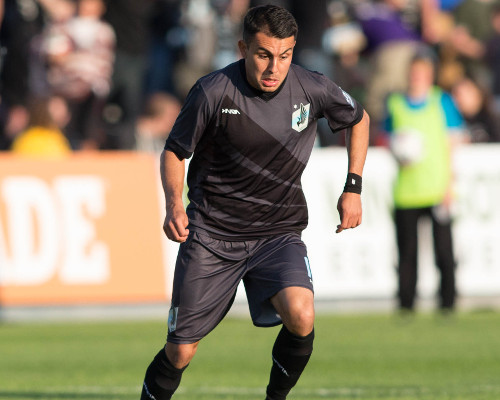
I think what makes me even more excited about the idea is the Hounds inadvertently dabbled with it this season with the dark camo kits-
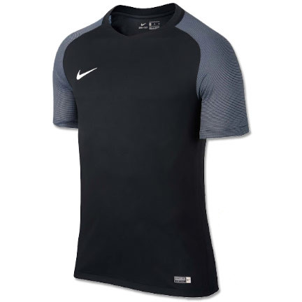
I’m generally an anti-camo jersey guy, but those looked really good (white shorts aside). I wouldn’t expect the Hounds to do something completely custom like Minnesota did, but there are some good new Nike templates they could totally rock-
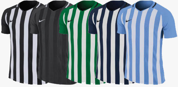
If they could add a gold accent around the neck of that black and grey stripped one above, *insert Fry take my money gif here*
Macron has also made some really nice grey kits in recent years if the Hounds ever change clothing providers.
To bring my ramble to a close- the blue secondary kits have served us well over the years, but I’d like to see the team move on to a more cohesive Pittsburgh look. Especially if the re-brand ever happens. Dark kits can be just that look, and would compliment the primary golds oh so well.
Welcome to the offseason where nothing really happens and we daydream about kit designs.
#UNLEASH